Create a reusable custom Button in React Native

React native Developer, Life long learner, Jesus Christ lover.
React Native ships with a default button component which you can find here. A big con of this button is that it is not highly customizable. For this, it becomes necessary to create your own custom button component if you want to play around with alot of things.
We will be using the React Native's TouchableOpacity component to create our custom button component. This button will also accepts props.
First,
- set up a new React native project;
- create an
srcfolder and add acomponentfolder inside it. - Create another folder inside the
componentfolder and call itCustomButton. - Inside
CustomButton, add anindex.jsfile.
Your file structure should look like this
src
    |components
            |CustomButton
                |index.js
Render the CustomButton in your App's index.js;
Add the following lines of code in the CustomButton's index.js file.
// CustomButton/index.js
import React from 'react';
import {Text, StyleSheet} from 'react-native';

const CustomButton = () => {
  return (
        <View style={styles.container}>
           <Text> hello button </Text>
        </View>
    );
};

export default CustomButton;

const styles = StyleSheet.create({
  container: {
    marginTop: 50,
  },
});
We'll use TouchableOpacity to replace the View component in the file,
..
import {Text, TouchableOpacity StyleSheet} from 'react-native';
...
    <TouchableOpacity style={styles.container}>
      <Text> hello button </Text>
    </TouchableOpacity>
...
The TouchableOpacity receives View props plus another one called onPress which accepts a function.
...
 <TouchableOpacity style={styles.container} onPress={() => console.log("Haha I'm about to be button")}>
      <Text> hello button </Text>
With this, anytime we press the hello button text, we'll see a "Haha I'm about to be button" in the console, go ahead and try it.
Let's begin to style this button
// Here I changed the text and added style prop
...
 <Text style={styles.title}> SEND </Text>
Here's the new styling
const styles = StyleSheet.create({
  container: {
    marginTop: 50,
    backgroundColor: '#512DA8',
    height: 48,
    alignItems: 'center',
    justifyContent: 'center'
  },
  title: {
      color: "#fff",
      fontSize: 16,
  }
});

Of course, you can add other stylings you deem fit.
Currently, our button is static, let's make it dynamic and reusable. That is, what if we want to change the title from SEND to CONTINUE, what about the color of the button, and what if we want the button to do something else when pressed etc.
To achieve this, we'll make the button accept a number of props
- title: to change the button's title. It takes a
stringdata type. - onPress: to pass in any function of choice. It takes a function.
- buttonColor: to change the color of the button. It takes a
stringdata type. titleColor: to change the color of the title text. It takes a
stringdata type.Also we'll add general styling prop in case we want to override the default styling for both
titleandTouchableOpacitywe'll call them- buttonStyle: It takes an object of styles.
- textStyle: It takes an object of styles.
Set up the props like this
...
const CustomButton = ({
  title,
  onPress,
  buttonColor,
  titleColor,
  buttonStyle,
  textStyle,
}) => {
  return (
...
Then put them in their proper places
For title and onPress prop
<TouchableOpacity
  style={styles.container}
    // Here
  onPress={onPress}
>
//Here too
  <Text style={styles.title}> {title} </Text>
...
So, for the TouchableOpacity we have
...
<TouchableOpacity
// This here
      style={{...styles.container, ...buttonStyle, backgroundColor: buttonColor || '#512DA8' }}
      onPress={onPress}
>
...
and for the Text we have
//This here too
...
<Text style={{...styles.title, ...textStyle, color: titleColor || "#fff"}}> {title} </Text>
...
Notice how we used a javascript spread operator to accomodate for many styles and we also added a default backgroundColor and text color for the button and the text respectively. They will act as fall back.
Here's the current code
import React from 'react';
import {Text, TouchableOpacity, StyleSheet} from 'react-native';

const CustomButton = ({
  title,
  onPress,
  buttonColor,
  titleColor,
  buttonStyle,
  textStyle,
}) => {
  return (
    <TouchableOpacity
      style={{
        ...styles.container,
        ...buttonStyle,
        backgroundColor: buttonColor || '#512DA8',
      }}
      onPress={onPress}>
      <Text
        style={{...styles.title, ...textStyle, color: titleColor || '#fff'}}>
        {title}
      </Text>
    </TouchableOpacity>
  );
};

export default CustomButton;

const styles = StyleSheet.create({
  container: {
    marginTop: 50,
    backgroundColor: '#512DA8',
    height: 48,
    alignItems: 'center',
    justifyContent: 'center',
  },
  title: {
    color: '#fff',
    fontSize: 16,
  },
});
To take adavantage of these props, open App.js or anywhere you rendered the CustomButton component and add the following:
...
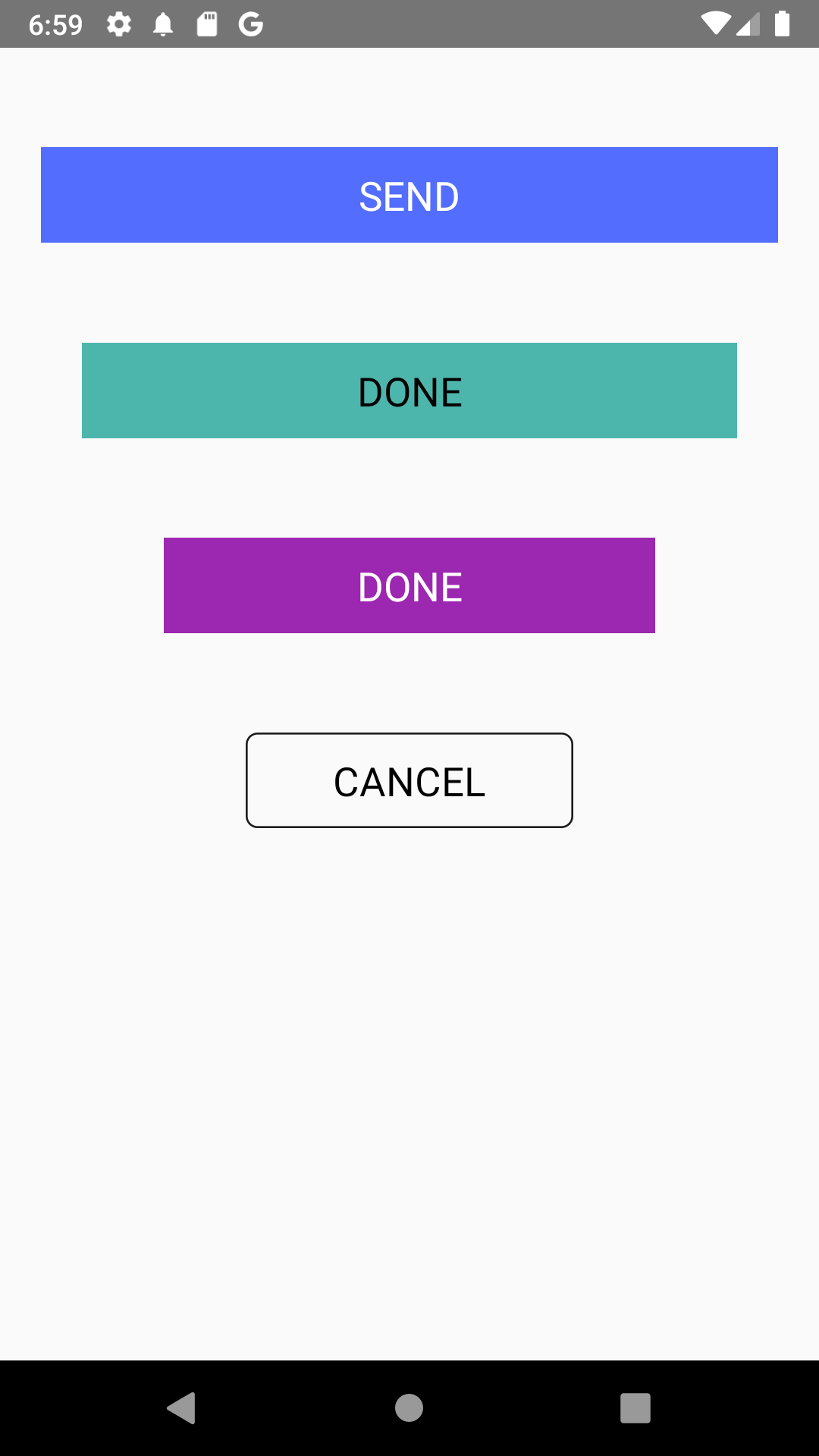
<>
<CustomButton
buttonColor="#536DFE"
title="SEND"
buttonStyle={{width: '90%', alignSelf: 'center'}}
textStyle={{fontSize: 20}}
onPress={() => console.log('I am the first button')}
/>
<CustomButton
buttonColor="#4DB6AC"
titleColor="#000"
title="DONE"
buttonStyle={{width: '80%', alignSelf: 'center'}}
textStyle={{fontSize: 20}}
onPress={() => console.log('I am the second button')}
/>
<CustomButton
buttonColor="#9C27B0"
titleColor="#FFF"
title="DONE"
buttonStyle={{width: '60%', alignSelf: 'center'}}
textStyle={{fontSize: 20}}
onPress={() => console.log('I am the third button')}
/>
<CustomButton
buttonColor="transparent"
titleColor="#000"
title="CANCEL"
buttonStyle={{
width: '40%',
alignSelf: 'center',
borderWidth: 1,
borderColor: '#1c1c1c',
borderRadius: 6,
}}
textStyle={{fontSize: 20}}
onPress={() => console.log('I am the fourth button')}
/>
</>
...
We'll get
That's it, you've succeeded in creating a reusable custom button in React Native.
If you enjoyed this article please Like, share and add your comments.
You can also follow me on twitter


